part 1: reflection

Below is my reflection on Part 1 and, below that, the 10 drawings I have chosen to submit for comment (in chronological order for each subject). I completely misunderstood the difference between Assignment 1 and Part 1, thinking that the culmination of Part 1 was Assignment 1. I confess that I found the pace rather rapid for an estimated average 8 study hours per week, but thought perhaps I just worked rather slowly! I also had specific and particular time constraints, which end tomorrow, and which also made it difficult for me to reach the end of Part 1 in what I thought was the designated timeframe. I now realise my error but,  having persevered,  made it to the end of Part 1 and feeling that I have made significant progress, I am reluctant to backtrack greatly. Also, having looked ahead, I think I have enough to work with on subsequent exercises/parts although, now seeing I have plenty of time, I may revisit the final botanical drawing exercise before moving on to Part 2. I will make that decision when I review my collected drawings.

Reflection

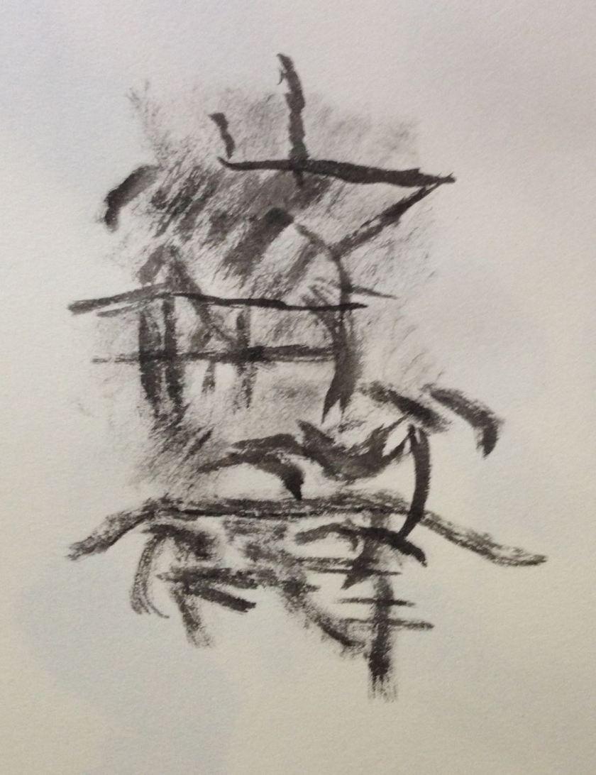
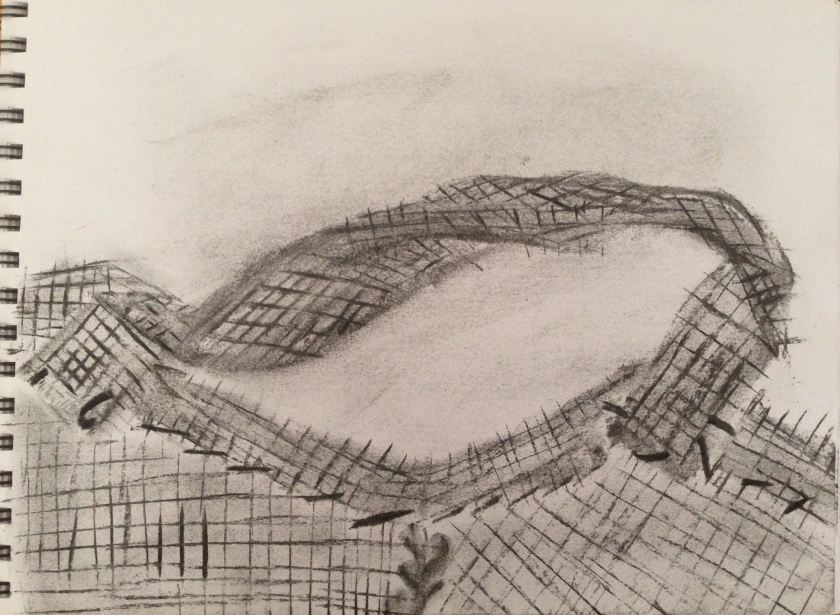
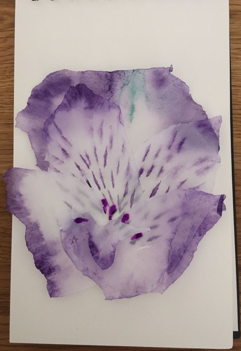
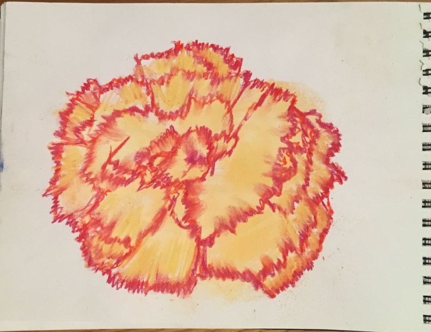
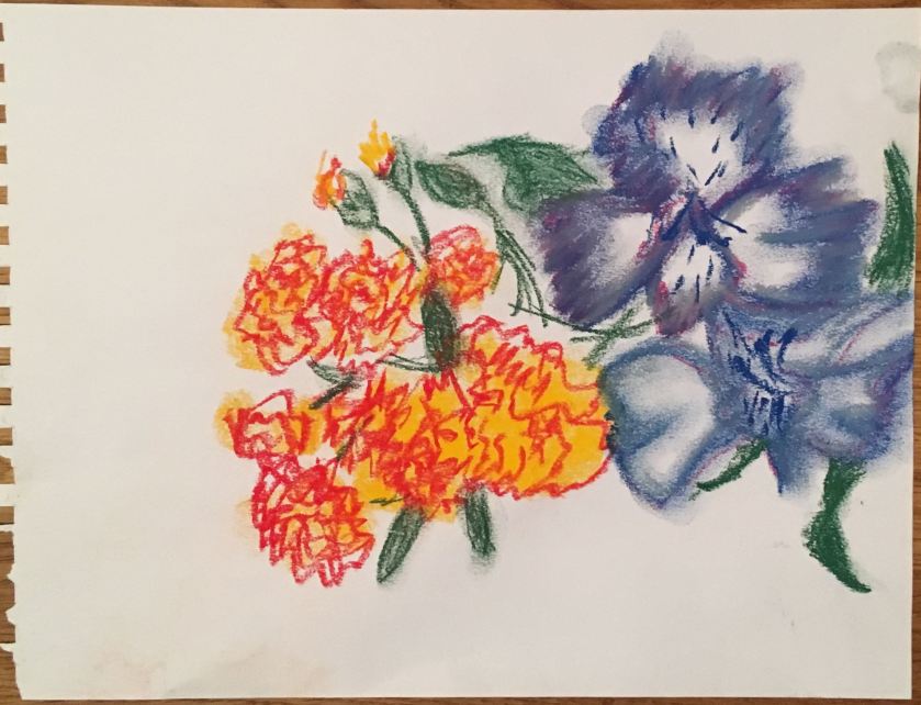
I need to focus on ‘loosening-up’ my drawing, because when I do the results are far more interesting and dynamic. I think I have made progress with this, my first small, feint, tentative – and boring – drawings giving way to bolder, larger and/or larger scale representations as I came to understand that I was trying to capture essential qualities, not exact likenesses. Nevertheless, even when I try to draw quickly, I can end up making careful, detailed, time-consuming studies. While there is (obviously) a place for such detailed drawing, I need to be sure it is necessary for my purposes. Also, I might sometimes only have the opportunity to draw something very quickly and a number of rapid drawings from different angles will give me more to work with subsequently than the one careful drawing I could produce in the same time. I guess this will come with confidence and practice and, hopefully, the fact that I am conscious of it will also help.

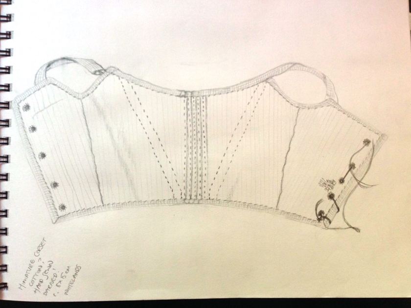
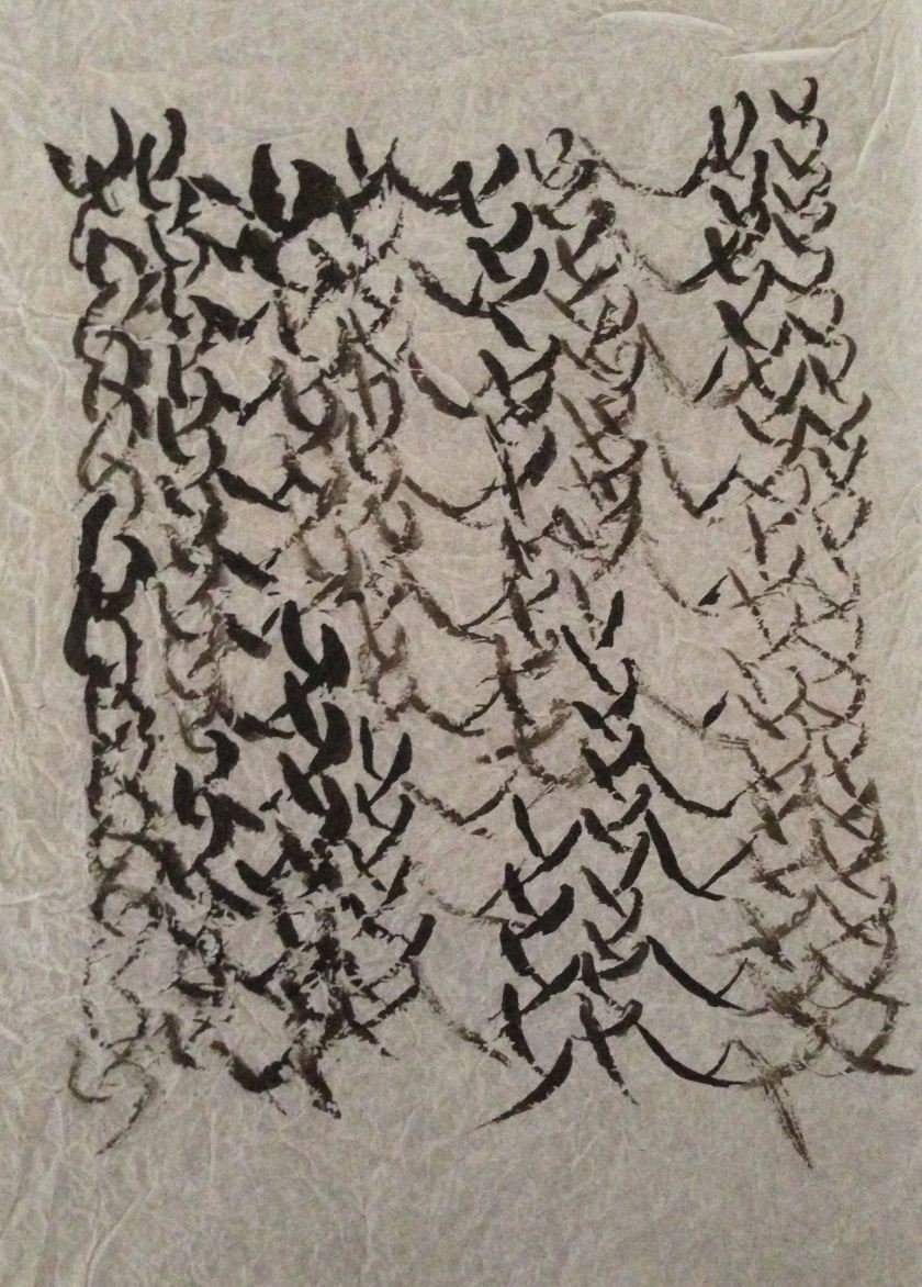
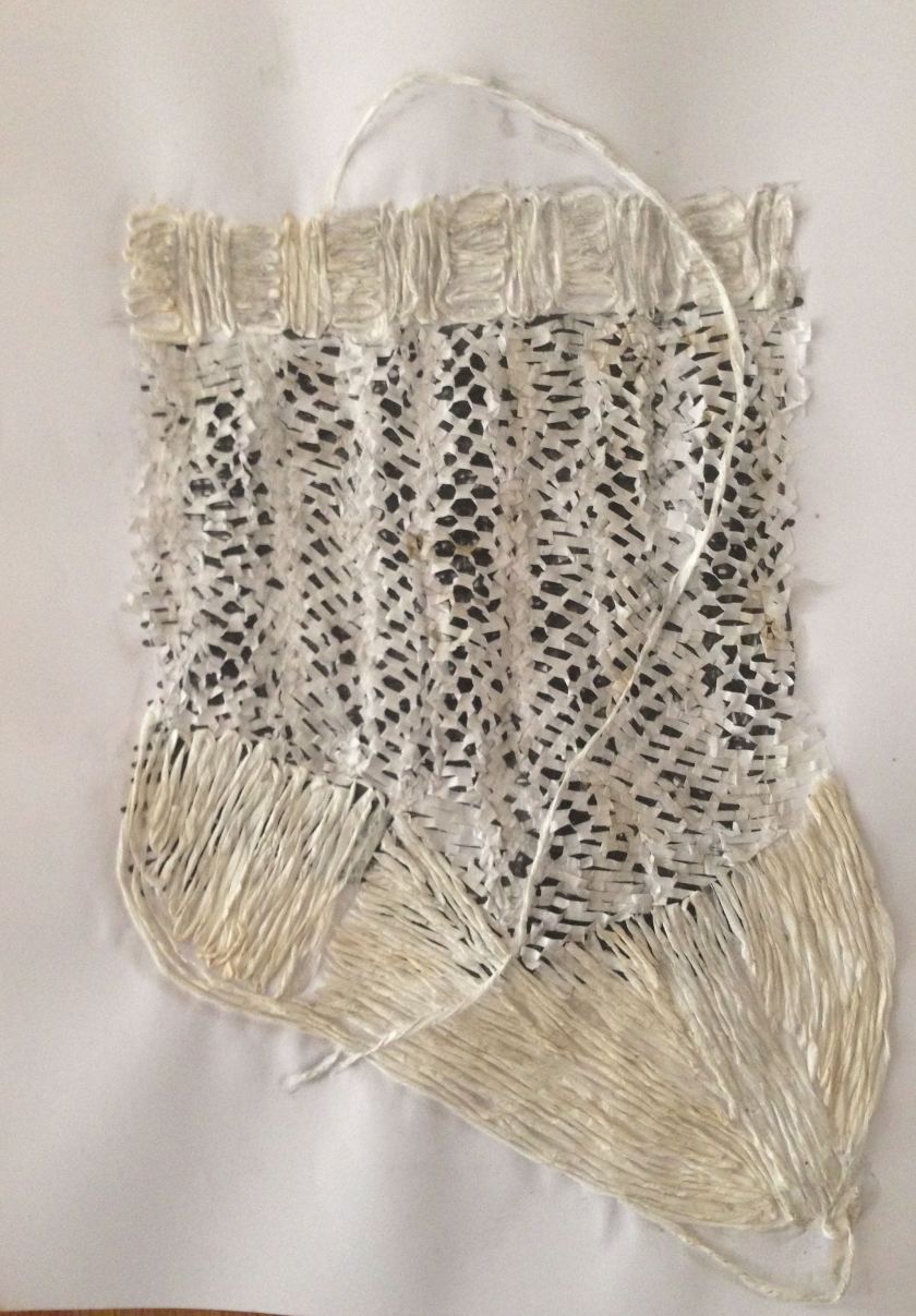
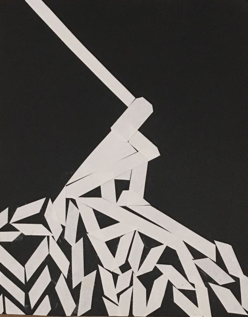
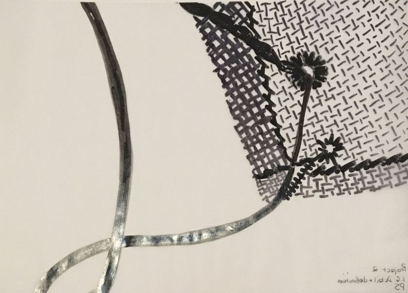
However, I do think I’ve been fairly experimental. Across the Introductory Project and Part One, I have drawn on, over or with: plain, square, white, coloured, tissue, packaging and rice papers, pencils, charcoal, ink, markers, watercolours, tea, paprika, coffee, pastels, watercolours, rice, sandpaper, brushes, matchsticks, card spatulas, my fingers and on regular- and irregular-size surfaces from A5 to A1. (All but one of the examples below are A4 or A5, but experiments with other sizes are shown on other blog pages.)

I’ve learned a huge amount about the difference between looking and seeing and begun to understand how drawing really helps to see what’s really there, rather than what I think I’m seeing.

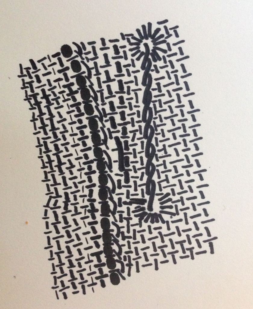
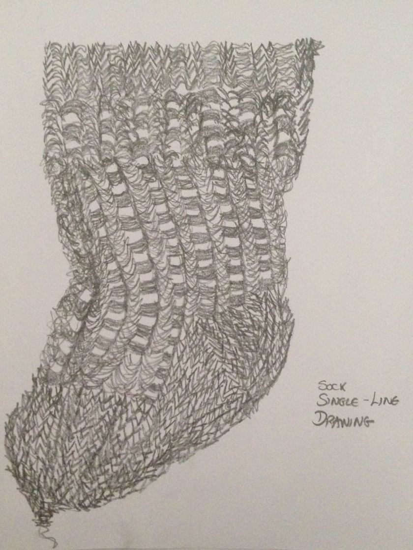
I’ve learned that I tend to line-draw and need to explore other methods, and that certain kinds of drawing are more effective for different objects and/or purposes.

My love of pattern has come to the front of my consciousness, as has my interest in the depiction of light (Petherbridge, Jacklin, Hockney),  and I realise that I am seeing everything differently, seeking patterns  in the arrangement of windows in buildings, of paving slabs, in the swirly formica on a café tabletop.

While still at the very start of this journey I feel that I have already come a long way. The enormous potential for further development, exploration and experimentation on the long road ahead is very, very exciting.

IMG_0038
Tiny corset, pencil, A4 sketchbook
IMG_0025
Detail of tiny patch of darning on miniature corset, brush and ink, A5 sketchbook
IMG_0027 (1)
Detail of fabric, seam, eyelet holes and lacing on tiny corset, marker, A5 sketchbook
IMG_5209
Armhole/shoulder strap of tiny corset, charcoal, A4 sketchbook
IMG_5193
Detail of of tiny knitted sock, ink on crushed tissued paper, c. A4
IMG_5185
Sock drawn as single line without lifting hand from page. 6B graphite pencil, A4 sketchbook
IMG_5204
Collage of tiny sock, ink, expandable packaging paper, tissue, glue, A3 paper
IMG_0003 (1)
Alstroemeria, tissue paper, water colour, marker, glue, A5 sketchbook
IMG_0021
Carnation head, soft pastels, A4 sketchbook
IMG_0015
Carnations and alstroemeria, soft pastels, A4 sketchbook (Hate the alstroemerias, but love the manic carnations.)

1.8 portraying by drawing

While I wasn’t keen on the purple and orange combination of my chosen flowers, I had chosen them both because I liked the colour-bleed effect on the petals of each and, while this could be represented in monotone, I thought it would be more effective in colour – and I was keen to have a go at introducing colour. But, yes, it certainly made it a more challenging task! I was determined to try different drawing techniques for this exercise, but thought collage would be the one I enjoyed most and would find most successful. How wrong I was.

I wasn’t especially interested in trying to draw the whole bunch of flowers in its vase, but more excited to focus on individual flower heads and the patterns on/of them. I did, though, think I should try to do some drawings of at least a group of flowers. However, I started with a collage of a single alstroemeria, using tissue paper, watercolours and felt pen in my A5 sketch book.

IMG_0003 (1)
Alstormeria head, tissue paper, watercolour, felt pen and glue in A5 sketch book.

I made this quite quickly and it seemed an effective return for quite a small amount of work. Encouraged by the result I went on to make a collage of both types of flowers in the vase, as seen from an aerial perspective. I began by trying to find the right reds/yellow/oranges to tint the tissue paper and, in the process decided to try some watercolour renditions of a carnation head.

IMG_0007
Carnation head, watercolours in A4 sketchbook.

I’m not wild about the one drawn from the side view, but pretty happy with the aerial view. Having sorted out the colours I wanted to use and tinted various sheets of white and cream tissue paper, I set to work on my collage …  I abandoned this after several hours because it was taking far far too long, which isn’t necessarily a problem of itself (though was an issue here because of my present time constraints), but much more importantly, wasn’t getting me where I wanted to go. I quite like the large (slightly cubist) carnation, but I realised I had slipped back into over-careful mode and the drawing had become rather flat and dull.

IMG_0012
Carnation and alstoemerial collage, tissue paper, watercolour, markers and glue, A1 sketchbook.

So I moved on to soft pastels.   I need a lot more practice using them, but I did feel that my drawings captured a great deal more of the energy and spontaneity I was aiming for – and, I enjoyed making them.

IMG_0021
Carnation head, soft pastles in A4 sketchbook

C

IMG_0015
Carnations and alstroemerias, soft pastels, A4 sketchbook

The single carnation head certainly has more life than the collage (though I think the watercolour may have more), but what I really liked was the carnations in the bottom image – the alstroemerias are terrible (should definitely have used bigger paper), but I love the rather manic carnations and they certainly give a better impression of the jagged mix of colours I saw when I looked at them.

I found it difficult to think of different ways to draw these flowers, so moved on and returned to the drawings later (after submission for tutor feedback). The final drawings I did were much simpler and I think the last – the green stem cut-out – is probably the most successful, and certainly the one I like best. I also like the overlaid torn watercolour strips, and I think drawing with yarn, as with the mohair on paper carnation head, is a technique worth exploring further in future (though with more glue control to avoid the blobs. The only positive thing i can say about the pastel and gouache alstroemeria close-up is that is has some energy!

img_4981
Pastel and gouache on paper, a3
img_4994
mohair yarn and gouache on paper, a3
img_4976
watercolour on torn a4 watercolour paper,
img_4982
cut out paper over khadi tissue paper, A1


part one: research point 3

All images from: http://www.davidhockney.co/home

It was interesting to look at Hockney’s work across the decades and to see the different techniques he uses and the way he moves on from one style of drawing and returns to it many years later. The spiky trees and muted tonal colour palette of the 1957 Trees in a Landscape is in many ways strikingly different from the vibrant hues and simplified shapes of Santa Monica Boulevard, 1979 – I am looking particularly at the different ways he portrays the trees in the two works – but at the same time, there is a similarity in the composition with the viewer’s attention drawn to the ‘action’ (trees/people and tree) in the foreground) and only then moving to consider what lays behind, and the horizon line placed just above the halfway mark.

trees in landscape
Hockney, Study of Trees in a Landscape, 1957
santa monical blvd 1979
Hockney, Santa Monica Boulevard, 1979

The colours and simplicity of Santa Monica Boulevard have become almost psychedelic in the 1990 The Railing and the ordered linear composition has given way to exaggerated perspectives and no clear horizon line:

the railing 1990
Hockney, The Railing, 1990

Yet elements of all three can be seen in more recent work, such as Bigger Trees Nearer Warter, Winter 2007 and The Arrival of Spring in Woldgate, East Yorkshire in 2011. Both return to the linear composition, but with a lower horizon line. Bigger Trees echoes the massed overlapping trees of Trees in a Landscape and the intense blue sky of Santa Monica Boulevard. Both make use of a vibrant colour palette, though where, in Bigger Trees, it is used in the tree branches it creates more muted tertiary tones with  bright flashes of green and purple. In  Arrival of Spring, the bright colours are more isolated – the purple, rust and orange tree trunks, green and yellow leaves, the raspberry path. While the composition is ordered, the imposition of the diagonally-travelling rounded leaves against the vertical tree trunks and the colour palette evoke a sort of controlled psychedelia.

bigger trees 2007
Hockney, Bigger Trees near Warter, Winter 2007
arrival of spring 2011
Hockney, The Arrival of Spring in Woldgate, East Yorkshire, in 2011

Some of my favourite Hockney works are the 1980s home-made prints, in which both the style and colour palette are seemingly inspired by mid-century modern. In these works, the flowers and plants are little more than squiggles which contrast with the bold and more defined outlines of the vases and table.

red blue and green flowers 1986
Hockney, Red, Blue and Green Flowers 1986
still life with curtains
Hockney, Still Life with Curtains, 1986

The same sense of ‘ordered psychedlia’ seen in Arrival of Spring  recurs in some of Hockney’s  recent computer drawings, such as Summer Sky, 2008, where the low horizon and path, verges and quite naturalistic trees lead the eye to the vanishing point from which explodes a fountain of blue and white cloud and sky.  Yosemite Suite, 2010, repeats the stark vertical trees of Arrival of Spring, but with still more intense colours including an almost neon yellow contrasting starkly with the adjacent black tree trunks.

summer sky 2008
Hockney, Summer Sky, 2008
yosemite suite 2010
Hockney, Yosemite Suite, 2010

1.7 sources and media

It feels quite amazing that I’ve already got to the final project in Part 1. Time has not been on my side and it seems that everything has been done in a hurry and I have always been left wishing for more time to experiment further. That’s doubtless better than wondering what else I could do, it means there is still lots to explore in the future and I suspect however much time I had I would still be in the same position.

So, at the time I was able to start this project my easiest access to plants was to buy some flowers from the supermarket. This seemed straightforward, but on the day I went there was a really limited choice so I ended up buying a bunch of purple alstroemerias and some yellow/red/orange carnations. Both had a lot of visual promise, but it also meant I ended up with one of my least favourite (1970s) colour combinations!

I don’t have any particular media I want to use, though suspect I will do at least one collage, but I do need to try to be a bit bolder in my experimentation and to try and make at least some of my drawings bigger, or at least, larger scale.

part one: resarch point 2


Timorous Beasties, Erdem, Marni

I enjoyed this research exercise because Erdem, Marni and Timorous Beasties were already favourites and although it is probably not possible to enjoy their work and not realise they all use floral motifs, I had not consciously thought about this before, or the different ways they employ them. So, it was interesting to compare the detailed, regular, symmetrical line drawing technique of Timorous Beasties with Erdem’s more romantic, often ’70s-style floral motifs and Marni’s very bold interpretations, again with something of a nod to the ’60s/’70s. Also the different ways that each designer uses floral motifs – at one point Erdem’s prints are awash with colour, elsewhere they are monochrome, tone on tone.


The question of why floral ‘motifs are so important, dominating or recurring in their work’ is rather more challenging. I suppose the one thing they all have in common is that they are all using repeat patterns on lengths of fabric (including paper) and the potential symmetry of plant designs lends itself to that. Also, the sheer variety of plants and their multitude of colours offer a seemingly infinite array of designs which can be adapted to complex or much more simplistic interpretations. And each is continuing a long tradition of floral motifs in textile designs, but offering their own contemporary interpretation of it. Doubtless there are also many other reasons I am yet to discover

ps: opened my inbox this morning to find circulars from Whistles promoting its ‘statement print to know this Autumn’, a bold palm print, an online fabric retailer announcing the arrival of Anna Maria Horner’s ‘Floral Retrospective flower collection’, cotton prints featuring a range of floral motifs including echinacea, roses and poppies, another advertising its ‘Beautiful Botanicals’ cotton prints. Plant-inspired textiles everywhere!

1.6 detail and definition

In a previous entry I said I was surprised when I reached a particular exercise because it seemed to be asking me to do what I had been doing all along, which made me realise that there must obviously have been other ways of working I had not thought about. I had a similar sense when I got to this final exercise in Part 2 because it asked me to focus on detail and, again, that’s what I’d been doing anyway. I think this is partly because the items I’ve chosen are small (actually tiny), so the opportunities to consider drape and different arrangements of the fabric were not really open to me. But also, one thing I’m learning is that I’m much more interested in drawing small things large, than vice versa. It may be that I am just more comfortable with this way of working, but I don’t think so. I genuinely think I am simply more interested in looking very closely at detail and enlarging it.

IMG_5209
Miniature corset shoulder strap detail. A4 sketchbook, charcoal

Because I had anyway been looking at detail I moved on and returned to this exercise some time later (after submitting the work to my tutor) and made a couple more drawings using different techniques and papers. I still need to think more about this and work with more tools and materials, but I did move away from the charcoal drawings on which I seem to have been focusing. I wasn’t very keen on the marker/sharpie drawing, but I was quite pleased with the collage  and, as has happened before, liked it better when I came back to it after a while than I did when I made it. I think that may be because I then look at it simply as a drawing in its own right, rather than assessing how much it resembles what I was drawing.

img_5015
paper collage, A4
img_5018
permanent marker and sharpie on tracing paper, A4

part one: research point 1

Wabi-sabi

I guess the difficulty in trying to consider the relevance to my archive of wabi-sabi is the seeming impossibility of defining what it actually is. But taking the idea of beauty in imperfection I think it might be useful to think in terms of appreciating what something is, not what it might have been, or was supposed to have been at some earlier stage of its existence. We might, for example, appreciate the delicate fronds of a fabric frayed with age rather than lamenting that they ‘spoil’ a beautiful textile.

In terms of the archive I am using for Projects 1 and 2 of Part One, I found Mikiso Hane’s explanation helpful. Speaking of the Zen masters of pre-17th-century Japan Hane says that:

‘the aesthetic qualities [they] prized were wabi  and sabi. Sabi is associated with” age, desiccation, numbness, chilliness, obscurity.” It is also the quality of mellowness and depth that comes with ageing. Wabi is related to a sense of serenity, rusticity, solitude and even melancholy. Both signify the “aesthetical association of poverty.” (Mikiso Hane, Modern Japan: A Historical Survey, 1992, p. 21.)

The tiny corset I have been using is discoloured, the strings are frayed, there are stains and rust spots, there is even a darn. These are not so much imperfections as evidence of the artefact’s age and history. Studied closely they become beautiful, inspirational patterns and textures. Given that my three chosen items come from an archive of needlework produced by nineteenth-century working-class girls, they closely align with the notion of an ‘aesthetical association of poverty’ – especially, perhaps, the darning sampler – and the long hours of labour-intensive work needed to produce them evoke a sense of solitude and either serenity or melancholy, dependent on whether the maker enjoyed the work or endured it as one aspect of enforced female domesticity.


1.5 collage and creases

I love, love, love making collage, so was excited to reach this part of the course. I knew it was coming up and when I happened to receive a parcel with packaging materials which I immediately thought would be great for a collage of the sock I kept hold of them.

I thought a black background would be good to show the holes in the openwork pattern of the sock, in the absence of black card or paper I used a black marker to create enough of a background on a piece of white paper. I used a combination of crimping and spreading the expandable packaging paper to create the openwork parts of the sock and strips of twisted tissue paper for the rib and stocking stitch sections. I liked how the expandable paper was able to represent the unevenness of openwork pattern on the sock, but the white on white of the rib and stocking stitch was too stark, so I brushed a tea wash over the whole thing which I thought worked well (although it picked up a bit too much of the black marker), again mirroring the unevenness of the staining on the sock. Finally, while trying to maintain a largely 2D image (though I’m still not convinced that’s possible with collage), I could not resist the superimposition of a strand of tissue to represent the thread of yarn that runs from the tip of the toe, behind the sock and over the top edge and down.

IMG_5204
Sock collage, A3 paper, marker, expandable packaging paper, tissue paper, glue, tea

By the end, my hands sticky with glue and the whole collage damp  I felt a tremendous sense of satisfaction. I think this is a pretty successful collage in that it gives a good sense of the socks texture and the varying stitch directions of the different areas.

Where my first collage focused on texture, my second focused on pattern. Here I used a photograph of one of the areas of damask darning on the sampler so that I could look at it greatly enlarged as if under a microscope. The orignal area of darning measures c. 2.5 x 0.8 cm, the same area of my collage c. 40 x 12 cm.

Magnifying the image showed  slight irregularities in the thickness of the silk thread and the weave of the linen, the latter a natural feature of the fabric, the former doubtless due to age deterioration. But also, it showed that the stitching was much less geometrically symmetrical than it appears when viewed with the naked eye and, indeed, that Eliza Winton had miscounted the warp threads in the central section so she had to spread the design across an extra thread throughout.  My aim with this collage, then, was to capture those irregularities to show how they disrupted the pattern. I found some squared paper which provided a good background to represent the woven fabric, and while the original was stitched in purple silk, I just used what I had to hand – some bright pink paper – since my focus was pattern rather than colour. Again I thought the result was fairly successful, drawing to attention the way the pattern remains recognisable, but is clearly flawed.


IMG_5211
Damask darning collage, squared and pink paper, glue. Collage area c. 40 x 12 cm.

In the previous exercises I had been moving away from careful, precise drawings as I learned that the rarely captured the qualities I was aiming to capture and that looser more impressionistic drawings were often more effective. In this exercise I learned that there is a place for both, and that the key is to understand which sort of drawing is best suited to its intended purpose.

Curiously, the next page in Textiles 1 asked me to consider the notion of wabi-sabi. This is not a new concept for me, and is something I have thought about previously – I was a bit suprised when I first came across it, the beauty in imperfection (and the frequent sterility of perfection, to the extent that it exists) being something I found patently obvious. It was, though, interesting to be reminded of it – and to realise that this beauty of imperfection was precisely what I had been celebrating in my second collage!

1.4 lines and edges

So it was a bit of a revelation getting to this exercise because I realised that focusing on ‘different qualities of line’ is pretty much what I had been doing anyway – that this, in general, is what drawing is for me. Looking again at my previous work I see that only very occasionally do I move away from drawing lines and then perhaps doing something else within them. So, lesson for the future is to think about how I might do things differently – I think this will to some extent develop ‘naturally’ when I use other media like collage or paint. Meanwhile, on with the lines and attempts to make different types and uses of them.

The geometic patterns and buttonholes of the sampler were an obvious starting point and so I began exploring those with different thicknesses of marker.

This slideshow requires JavaScript.

I quite enjoyed doing these and I liked the fish-skeleton effect of the buttonholes and the thick-and-thin lines of the couching stitch, but on the whole I thought the results were less than exciting. Far more arresting were two drawings of the weave, stitching and ‘lacing’ of the corset.

IMG_0028
Corset weave and stitching detail, thick marker and medium Sharpie, A5 sketchbook
IMG_0027 (1)
Corset weave, stitching and lacing detail, thick marker and medium Sharpie, A5 sketchbook

The announcement of an upcoming Tove Jansson exhibition at Dulwich Picture Gallery alerted me to her use of  different types and directions of, especially short, lines to depict different textures.

museums-at-night-large-banner-1
Tove Jansson, Moomin drawing, no title/date given, Dulwich Picture Gallery

This also took me back to Deanna Petherbridge’s ‘Iterations’ series which I had looked at right at the start of the course and in which she similarly uses short lines in different directions but to very different effect.

e6acb6acacc9c64d6c2c95dafe950d7f
Deanna Petherbridge, Untitled, 2003, Ink & red chalk on cream paper, 57 x 76 cm,

Both provide me with lots of inspiration about the possibilities of such a seemingly simple techineque.

Moving on to drawing with my eyes closed (sampler), my left hand (corset) and without lifting the pencil from the paper (sock), was fun and informative, producing unexpectedly exciting and interesting results. All, I thought, contained a greater level of energy, visual interest and potential than any of the parallel drawings I originally made of each object using more conventional techniques.

IMG_5183
Sampler drawn with eyes closed. A1, pencil on paper.c Sampler drawn with eyes closed. 2B graphite pencil, A4 sketchbook.
IMG_5184
Corset drawn with left hand. 2B graphite pencil, A4 sketchbook
IMG_5185
Sock drawn as single line without lifting hand from page. 6B graphite pencil, A4 sketchbook

Being extremely short-sighted I think it will be interesting to try drawing without my contact lenses or glasses. I imagine that when trying to produce a generalised rather than detailed representation – fields of colour for example – I might be helped by not being able to see the detail.


1.3 marking marks

I started by making drawings of the whole of each object, beginning with a rather boring pencil drawing of the sampler.

IMG_0005

The positive was that I drew it on A1 paper, which is considerable progress as I tend towards small drawings on small paper – I think because they seem more manageable and are more easily ignored if I don’t like them. However, something I learned from the previous drawing exercises is that larger drawings can be more manageable when there’s a lot to fit in because you have to cram it all together in a small drawing, and that if the purpose of the exercise is to explore and to learn, I’m not really going to get very far if I try to hide things away.

The downside – one of the downsides – is that while my drawing captured the overall flatness of the sampler (drape is not one of its features), in my attempt to replicate the detail I completely failed to capture it’s essential outstanding qualities of regularity and neatness. I also realised that what really interested me about the sampler were the patterns of the stitching.

I next moved to the corset, this time drawing on A4 – a smaller piece of paper, but large in comparison with the corset itself. Again, my pencil drawing was dull and utilitarian, the latter in sympathy with the object, perhaps, but not visually exciting and certainly didn’t capture its textures (and the terrible photography doesn’t help here either).

IMG_0038

My techniques and drawings materials having to produced anything satisfactory for the sampler and corset, I decided to try something different with my first drawing of the sock which I drew with the tips of burned matchsticks – again on A4 which, again, was a large size of paper compared with the sock itself, and this time I filled much more of the page.

IMG_0008

This I felt was a much more interesting drawing and one which much better captured the texture of the object. Encouraged by the improvement produced by experimenting with materials and technique, and coming to an increasing realisation that what interests me is details and the patterns in the detail, I worked on more drawings using different materials which allowed freer movement, produced bolder images and, eventually, better represented textures.

I started by redrawing the sampler in ink. It still wasn’t very exciting, but more interesting and lively than the pencil drawing.

IMG_0024

Then I focused on the three samples of damask darning between the round and hexagonal patches.

IMG_0020

Still a huge potential for improvement, but a more dynamic and interesting drawing and the patterns had taken on a sort of ikat quality. Also – and I found this very exciting – I was looking at some of Margo Selby’s work, which I love, and began to get a first inkling of how a drawing might eventually lead to a piece of textile art. There seemed to me evident parallels between the damask darning samples and, for example, Selby’s Iceni rug which I am certain I would never have connected without doing the drawing.

selby iceni kelim
Margo Selby, Iceni Rug

I redrew the corset, this time folded in half in charcoal on a A1 paper.

IMG_0018

I still don’t think it captures the texture of the fabric at all, but I think it’s a much more interesting drawing and better represents the corset’s stained appearance, the rather rudimentary stitching around the armholes.

Attracted by the patterns formed by the centre front vertical lines of stitching I drew them in marker and Sharpie on rice paper, covered in charcoal and then mostly removed, to give a surface which more closely resembled the texture of the fabric.

IMG_5190

Using a bold sweep of charcoal to draw the shoulder strap and armhole of the corset gave a much better idea of its twists and turns – and I discovered that I could respresent these by simply twisting the charcoal itself as I drew.

IMG_0013

A brush and ink drawing of the much enlarged tiny patch of darning on the corset gave a much greater sense of the messy mesh of threads.

IMG_0025

Encouraged by the increased dynamism and visual interest of these bolder, simpler images, I tried to apply the same approach to detailed drawings of the sock, first using charcoal in my sketchpad, and then ink on crushed tissue paper, giving a much greater sense of its texture.

IMG_0025 (1)

IMG_5193

The message I took away from all this was that bigger, bolder and freer gives more dynamic and visually interesting images; that I need to decide what it really is that interests me about the object and that when it comes to materials I need to keep on experimenting. Ultimately, I think I did quite well with capturing the texture of the sock, but not the corset or the sampler. And, I now realise, that not only did I not capture the smallness of the sock and corset in my drawings, but I didn’t even try. I’m not too worried about that, because although it was what initially drew me to them, I very soon found things that interested more about them from the creative practice perspective.